Case Study

CHERR-IBLY
YUMMY

“An app that transforms the sweet nostalgic aesthetic of vintage into a fun and easy way to create healthy recipes.”

Project Duration4 Weeks
ToolsFigma
RoleUI Design
Type of ProjectPersonal
The Context

What is the product?

Cherribly Yummy is a mobile-first recipe app that reimagines classic, nostalgic desserts - like grandma's apple pie or vintage layer cakes - as healthy, sugar-free, and wholesome recipes.

It provides step-by-step guidance, smart ingredient substitutions, and a visually delightful experience that captures the sweet aesthetic of a 1950s bakery.

Who is it for?

It's for health-conscious individuals, home bakers, and people with dietary restrictions - like avoiding refined sugar - who miss the comfort foods of their childhood but don't want to compromise on their wellness goals.

They are primarily millennials and Gen Z who enjoy baking and aesthetic food presentation.

What market does it belong to?

The product belongs to the Digital Health & Wellness and Food & Recipe Tech markets, specifically within the niche of “Healthy Baking” and “Specialty Diets.”

What was the starting situation?

The challenge was to create a recipe app where I needed to develop the concept as well.

Inspired by a trend where people on social media were attempting to “healthify” vintage recipes but often failing due to complex chemistry or ending up with unappetizing results, Cherribly-Yummy was born.

There was a clear desire but no dedicated tool to bridge the gap between nostalgic flavor and modern nutrition.

The Concept

Existing healthy recipe apps treat food like fuel—clinical, joyless, and stripped of the soul that makes baking special.

Adapting a classic recipe was a manual, trial-and-error process that was time-consuming and often led to failure.

Most people feel that to eat healthily, they have to permanently say goodbye to the emotional comfort of traditional desserts—the “Guilt-Goodbye Paradox.” Cherribly-Yummy disrupts the norm by bringing back the fun and joy of baking, wrapped in a warm, nostalgic aesthetic that feels as good as the desserts taste.

The soft color palettes, retro textures, and classic typography aren't just decorative—they're a visual promise that these wholesome treats still carry the soul of the originals.

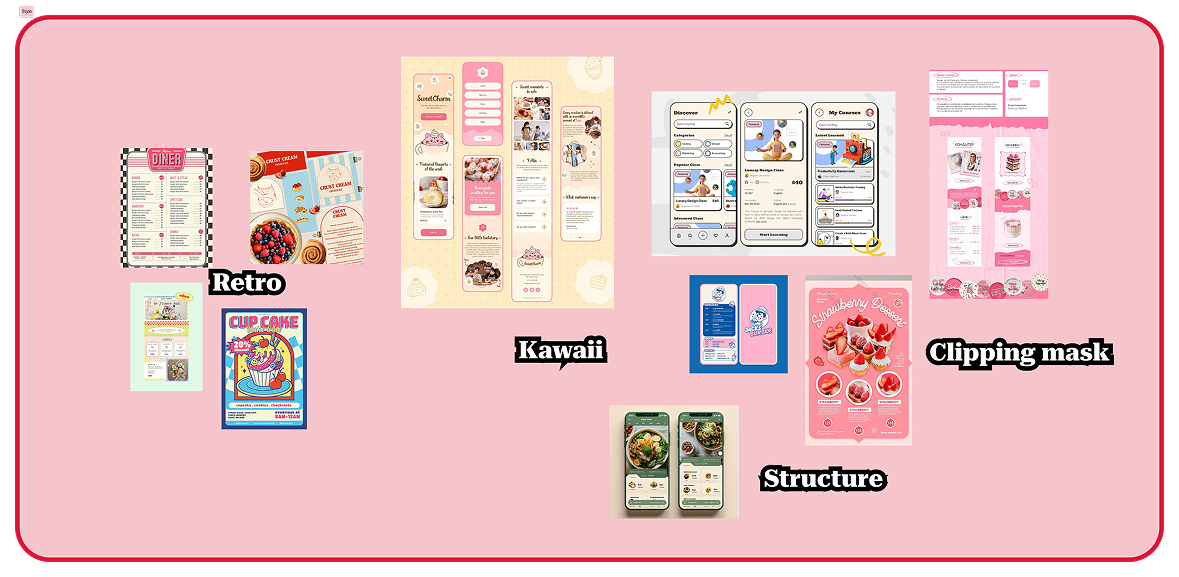
Moodboard
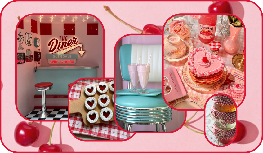
Moodboard
Visual Direction

Color Palette

Soft Blush Pink #F6C5CB

Background, cards, soft UI elements

The comfort color — warm, inviting, reminiscent of vintage frosting and old-fashioned candy.

Light Bubblegum #FDB1CF

Accents, icons, secondary buttons

A slightly sweeter pink that adds pops of playful energy without overwhelming.

Cherry Red #DC1635

Primary CTAs, alerts, “Cherry” brand moments

The vibrant pop of the palette—the bold, irresistible flavor. Used sparingly to guide attention.

Soft Mint #BFF2F8

Accents, icons, secondary buttons

A cool counterpoint to the pinks, keeping the palette fresh and balanced.

Light Gray #E5E7EB

Accents, icons, secondary buttons

A neutral that grounds the palette and gives content room to breathe.

Black #000000

Primary text (body)

High contrast for maximum readability in instructions.

Off-White #FEEEEE

Background base, negative space

A warm white—not stark bright—that keeps the interface soft and vintage rather than cold and clinical.

Typography

Finest Vintage
Headlines, logo, large titles

Captures the essence of retro bakery signage—curved, playful letterforms that immediately communicate “vintage dessert.” Used sparingly, only for hero moments.

Comic Sans
Accents, playful micro-copy

Used deliberately for small, whimsical touches—like “Grandma's Tip” boxes—mimicking a handwritten note tucked into an old recipe box.

Alkatra
Accents, playful micro-copy

Same informal, handwritten nostalgia as Comic Sans, used for fun facts and light asides throughout the app.

Space Mono
Body text, numbers

Highly legible, modern monospace that ensures users can read instructions quickly—even with flour on their hands.

The balance

The vintage fonts -Vintage, Alkatra and Comic Sans- deliver the emotional nostalgia, while Space Mono ensures usability.

This dichotomy mirrors the app itself: joyful vintage soul, wrapped in a healthy, functional experience.

Iconography

The decorative elements in Cherribly-Yummy are not mere embellishments.

They are visual anchors that transport the user into a nostalgic kitchen experience.

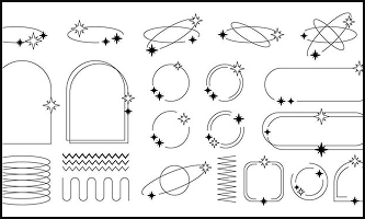
Giru decorative frames and whimsical illustrations

Giru — Decorative Frames

Whimsical illustrations and decorative frames—tiny whisk icons, cherry motifs, hand-drawn borders—play on vintage cookbook marginalia and inject handmade charm.

Pink and white checkered pattern

Checkered Background

A direct reference to classic vintage kitchen textiles—tablecloths, napkins, oven mitts from the 1950s—balancing the vintage vibe with the “healthy” aspect of the brand.

Arched panel shape

Arched Panels

Inspired by retro bakery storefronts and vintage kitchen windows.

An arch feels inherently welcoming—it softens the rigidity of a standard mobile grid.

Photography Style

Photography style references: Retro, Kawaii, Clipping mask, Structure

The photography style is intentionally designed to strike a balance between professional credibility and nostalgic warmth.

Clear, Filter-Free Photography

Recipe photos are crisp, well-lit, and free of artificial filters—driven by the need for trust.

Users following a healthy recipe need to see exactly what they're aiming for.

It communicates: “This is real food. It turns out exactly like this.”

Vintage & 80s-Inspired Staging

The staging—plates, backgrounds, props—draws from vintage and 80s aesthetics: retro dinnerware with classic patterns, and warm, lived-in styling with linen napkins and aged wooden spoons.

Wireframes

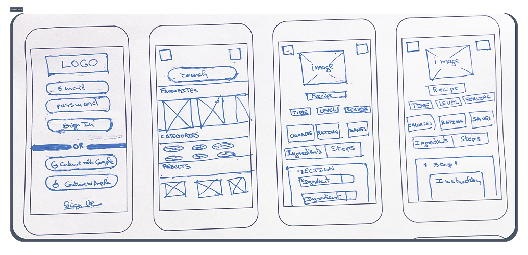
Low-fidelity

Low-fidelity wireframe sketches
▶ View Hi-Fi Prototype in Figma

High-fidelity

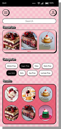
Home / Explore Screen

The home screen is designed to balance two key user behaviors: directed search and inspirational browsing.

Home / Explore screen
Search Bar

Placed at the top for users who arrive with a specific craving (e.g., "I want to make a healthy chocolate cake"). It's the fastest tool for goal-oriented users.

Filter Tags

Tags like "Sugar-Free," "Gluten-Free," and "Vintage Classics" serve a dual purpose: filtering an existing search or encouraging casual discovery with a single tap.

Your Favorites

Rationale: people tend to repeat recipes they loved. Placing them front and center improves retention and satisfaction.

Results

Take up most of the screen and update dynamically based on the selected tag or search query.

Recipe Detail Screen

The goal of this screen is to build trust and provide clarity before the user commits to baking.

Recipe detail screen, ingredients tab Recipe detail screen, steps tab
Hero Image

Visuals are non-negotiable. An appetizing photo is the first proof that the healthy version is worth it.

Key Metadata

Duration, difficulty, and servings answer: "How long will this take?" "Is it complicated?" "How many does it serve?"

Calories & Rating

Calories are essential info for the health-conscious user. Rating provides social proof that reduces skepticism.

Tabbed Navigation

Design decision: Two tabs toggle between "Ingredients" and "Steps" instead of an endless scroll. Why: Users can consult both blocks without losing context.

Design System

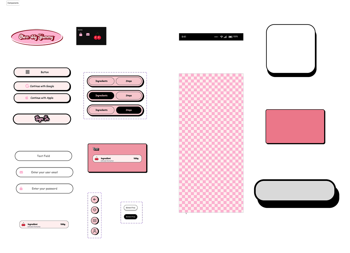
Components

Component library: buttons, chips, inputs, tags, cards

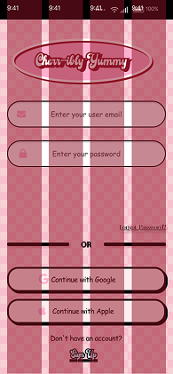
Grid System — 4 Columns

Sign in screen showing the 4-column grid overlay
Simplicity for Mobile-First

A 4-column grid keeps the layoutclean and manageable on a small screen.
It forces intentionality—every element must fit within this simple structure, preventing visual clutter.

Visual Rhythm & Vintage Aesthetic

A 4-column grid creates a sense of order, balance, and predictability.
This structured,almost “gridded” feel subconsciously reinforces the nostalgic and trustworthy nature of the brand—organized, reliable, and thoughtfully crafted, much like a well-loved vintage cookbook.

Flexibility for Content

Full-width elements -search bar, hero images, carousels- span all 4 columns, creating strong visual anchors.
Recipe cards often span 2 columns—a clean, symmetrical two-per-row pattern that's ideal for browsing.
Filter tags and icons can span 1 column, grouped within the grid for perfect alignment.

In Short: The 4-column grid is the invisible structure that brings consistency to the app. It allows us to switch seamlessly between a single-column flow (for reading a recipe) and a two-column browse (for exploring) without breaking the user's mental model.

What I Learned

This project taught me valuable lessons that go beyond pixels and prototypes.
Alignment is everything—literally and figuratively.
At first, I chose a 4-column grid without fully understanding why.
Through this project, I learned that a grid isn't just a technical constraint—it's a design philosophy.
The 4-column grid gave me the flexibility to create rhythm and balance.
More importantly, I learned that every design decision needs a “why.”

01

The Importance of Exploring Visually

Initially, I focused heavily on functionality.
But feedback pushed me to dig deeper into visual storytelling. Adding the checkered background, arched panels, and decorative giru wasn't just about making the app “pretty.”
It was about building an emotional world that users could step into. Visual exploration—trying bold, unexpected directions—can uncover the soul of a product.

02

Vintage Is a Feeling, Not Just a Style

I started with a vague idea of “vintage aesthetic.” Through iterating, I realized that true vintage design is about warmth, imperfection, and humanity. It's the opposite of cold, algorithmic feeds.
This shifted my approach from simply copying retro patterns to asking: “How do we make the user feel like they're in their grandmother's kitchen?”

Next Steps
01

Create more screens to test a complete flow

A full end-to-end flow needs to be built to allow comprehensive usability testing and identify friction points.

02

Conduct concept testing with real users

Interview 5–8 people matching the target audience to validate: Does the vintage aesthetic resonate? Is the “Guilt-Goodbye Paradox” a real pain point? Would they trust the recipes?

03

Develop a simple prototype for usability testing

Create a clickable prototype and test tasks like finding a sugar-free chocolate cake, substituting an ingredient, and navigating between tabs to generate quantitative data.

04

Explore accessibility improvements

Conduct an accessibility audit to ensure contrast ratios meet WCAG standards—especially for users with visual impairments.

05

Expand the recipe catalog concept

Test whether users want more filtering options (by occasion, difficulty) or community features (sharing bakes, commenting).